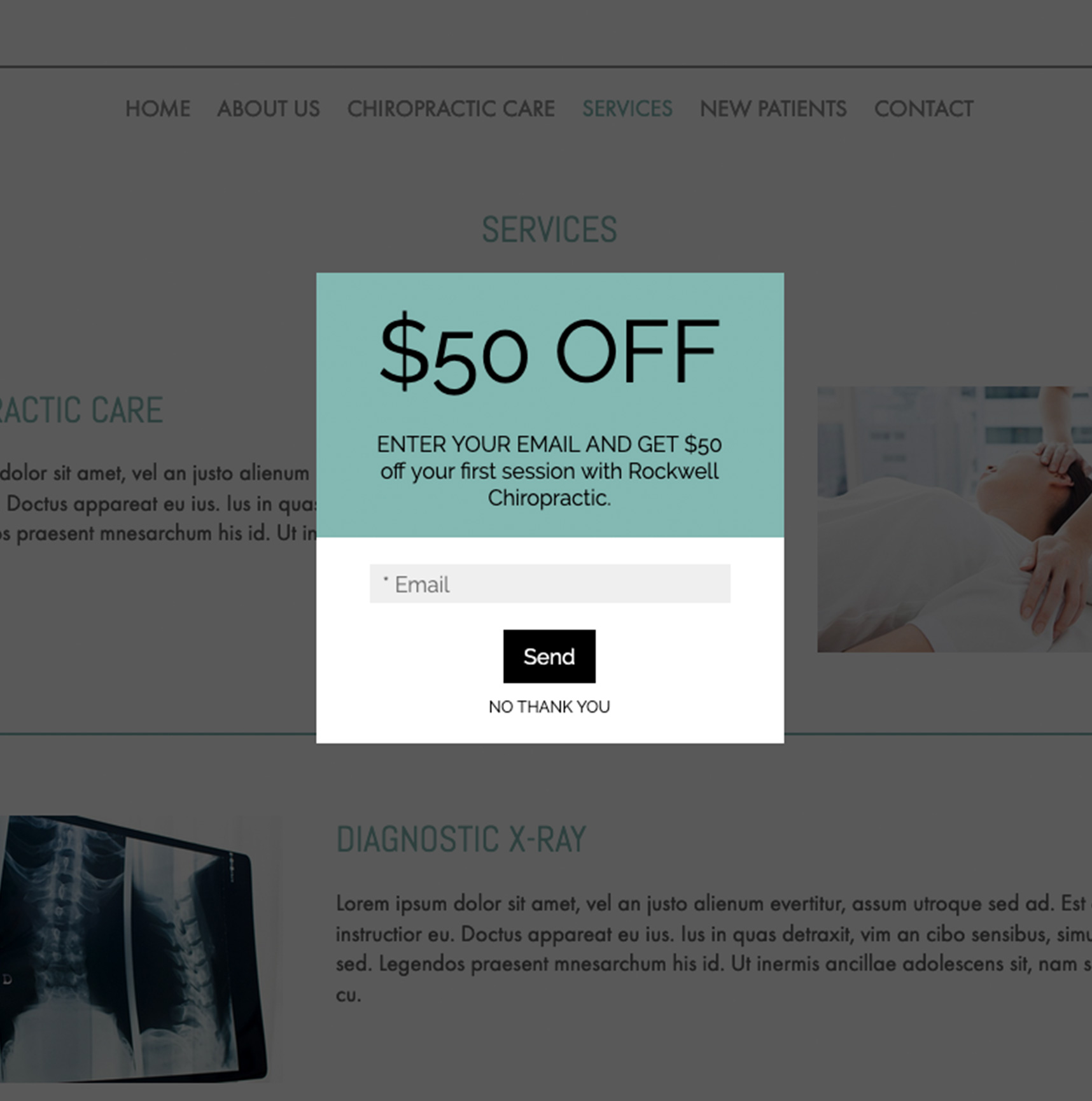
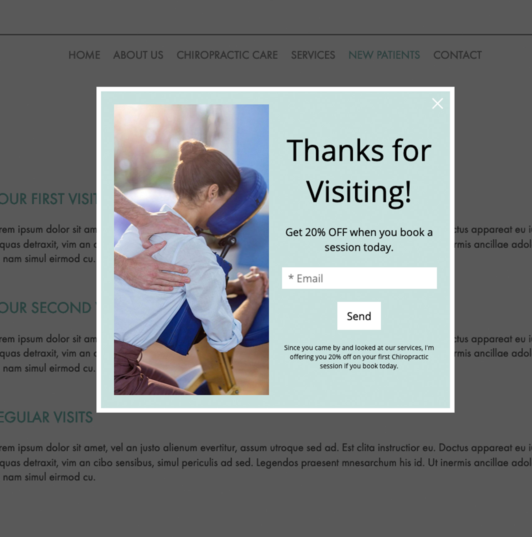
Pop-ups and sticky banners are powerful promotional tools to increase awareness and sales. As part of the Zibster platform, you have access to the marketing suite where you can create these types of promotions. A pop-up will do just what it is called. When a customer comes to a page, a box will pop up to directly capture a person's attention either right away, after they have been on a page for a certain amount of time, or after they take a specific action (like try to leave a site). Sticky banners are more subtle. They can stick to the top or bottom of a website and can get attention without interrupting a visitor’s experience.
But wait, aren't pop-ups annoying? Historically pop-ups interfered with the web experience. Twenty years ago, they mainly came in the form of third-party ads unrelated to the website you were viewing. They were hard to escape.
Today, pop-ups are effective tools to keep website visitors focused and to help guide them through sales funnels, turning leads into customers.
I believe there are three styles of pop-up banners that can grab attention without annoying your website visitors and convert visitors to customers. Let’s take a look at the three styles and when to use them.
1. Wait To Pop Up
People don't like aggressive marketing. They often like to browse before they buy. So if you hit them with a pop-up offer too soon, they may quickly disregard it. For example, you may have experienced the car sales tactic where as soon as you show up, a salesperson is asking what you want. This can be overwhelming. If someone lands on a site and immediately sees a "save 10% today" pop-up window, that can be overwhelming too. Often this results in one or both of the following actions:
-
They will click out of the window immediately.
-
They won't take advantage of the offer because they came to explore first.
With this in mind, consider waiting before engaging your pop-up window. Let people scroll the page a bit before it comes up. Let your customer experience your site then have a promotion pop up. Don’t just take our word for it. Sumo, a company that makes website automation tools, analyzed 2 billion pop-ups, and found that conversion rates are much higher when a banner doesn't pop up right away.
See the difference?


Your tone and how you present an offer is also important to sway a visitor to become a customer and make a purchase. You can be direct, but softer language tends to convert better.
Also, a word of caution: Pop-ups can wear out their welcome, especially on home pages, so use pop-ups sparingly.
2. Use Video
Video is one of the most effective ways to get a customer's attention. According to Forbes, 68% of online consumers prefer video over written content. It can allow you to showcase the experience of working together. It's a way to show how a product works. It’s a great way to promote an upcoming event or promotion. It's even a way to interact with potential (or current) customers without being in the same room with them and can lead people to contact you or make a purchase.
Great video pop-ups can include:
-
Showcasing a new product on a store page and with a link to that specific product.
-
Behind the scene look at what it's like to be in a photo session with you, with link to an artist statement.
-
Highlight reel of your recent finished products and link to purchase them.
Depending on the type of video you create, it’s a way to welcome them, see your work, and give customers the ability to envision themself as a customer.
3. Use sticky banners for long-running promotions or notifications
When you want to communicate a more subtle message that doesn't need to get directly in the customer's face, sticky banners are a great tool. They don’t take up a lot of real estate on your website and can be used for short or long periods of time.
For example, if you offer half-off sessions for a certain time period in an effort to increase sales, you can promote that in a sticky message on select high-performing pages of your website.
Sticky banners can also function beyond sales. You can use them to update people about a new studio address, a change in hours, or even to help people get in touch with you by including a link to your contact form.
When considering if and how to use these tools, remember that the most effective marketing doesn't feel like marketing.
-
Pop-ups can feel invasive, but you can soften the experience by delaying when the pop-up appears.
-
You can also present your message as a question versus a direct coupon to create a sense of reward for visiting.
-
Use video when you're able to 'show' versus 'tell' why people should book a session or buy something.
-
Lastly, use sticky banners for longer promotions or to notify customers of valuable information.
Pop-ups and sticky banners are incredible tools and you have access to them in your Zibster account. We have multiple built-in template designs to choose from, that you can quickly and easily personalize to fit your style. If you need help getting either pop-ups or sticky banners set up, our support team can assist you. Give us a call at 1.844.353.3412 or submit a support ticket, we're happy to help you.


Leave a comment
1 Comments
Jul 7, 2020, 5:12:58 PM
Paula Farish - I'd like help creating a sticky banner or pop up to promote our National Bridal Sale Event.