One thing We see a lot of is emails, and we strive hard to create emails for our own customers that are exciting to view. Having a well-designed email can lead to higher performing email clicks. Would you click on someone's email that you've signed up for and it wasn't branded and just had a text link saying 'Click Here'?
No, you wouldn’t.
(I hope.)
Craft A Compelling Headline
We've been trained to see email as either personal, promotional or spam. Encouraging people to click on your email starts with an engaging headline. You have to make people want to click on it, but you also don't want it to filter to spam.
"You won't believe this special deal" might end up in someone's spam folder before they even see it because email filters are actively crawling every email sent to each user in the world to protect them from scams or harmful emails.
So something like "One Day Only Deal" may work better, and be click-worthy to your clients.
Choose A Design, Or Build Something New
Once they are in the email you have to make the email look interesting. With the Zibster Email Marketing tool, we give you preset design templates for different kinds of emails. You can then change or customize them any way you want. We lay the foundation for you as a guide where many providers just say, "make your email.”
I find that sometimes having a foundation to start with is a fun challenge to create something different, instead of being left to create it out of thin air.
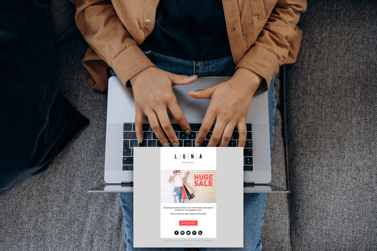
Take an email template such as this:
We already see the guidelines:
- Logo
- Bold image with the promotion to catch your eye
- Headline with the deal to excite readers
- A text blurb about the promotion
- A button to catch eye to push the to deal
- A footer, with your info
That's the standard email template. Easy as that! But you can change it up. If you noticed our emails over past few months, we've experimented with different designs, colors, layouts, and images that also function as links to make the email more engaging. We recently saw our campaigns perform better than when we were using just an RSS feed in Mailchimp.
Make Some Magic!
What's nice with Zibster Email Marketing is you can change how the designs are laid out. You don't have to start from scratch, you can start inside a template and modify it.
And you can get creative with the page elements – for example, you don’t have to use a dedicated logo block at the top. In this campaign, we put our logo on the image, then split it into two graphics that we stacked on top of each other. Now the block with our logo can go to the home page, and the other can link wherever.
You may say, That's a lot of work. Sure it is, that's why we gave you the basics to start with. But if you're adventurous and want to try creating something new, you may yield better results.
How the magic happens.
Have you tried Zibster Email Marketing? If you have a website with us, you have the tool package free with 25 emails as a starter pack. You can upgrade to more emails when you want to hit a larger volume of people. Give it a try and send us your email recent campaigns, we love to see them and showcase them!


Leave a comment
0 Comments