It’s a new year and that means you may want to spruce up your website for 2023. Here are some of the design choices that creatives are taking to make a more modern, gorgeous, and useful website this year.
1. Minimalistic design
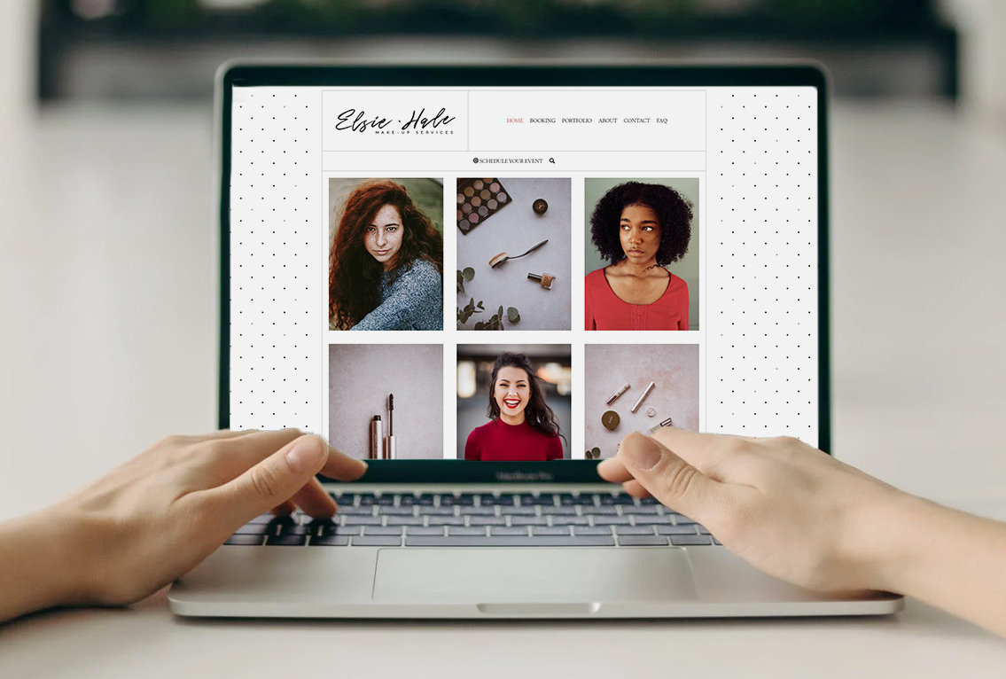
Less is more is a profound statement. This can apply to so much, including your website design. With a minimalist design style, you use the space and content within a design to tell a story. It also presents an opportunity to let your work stand out, rather than the website design. Minimalist website design is a great way to tell a story through gallery displays. By dividing up large image displays with content and using thick margins, you can really enhance your overall website experience, and let the images and words on each page of your website breathe.
Interested in a minimalist website template design? Check out King.
2. Symmetrical or grid design
Design has had a fluid or loose appearance as of late, but that seems to be retracting. The Photoshop or sandbox design, meaning you could drag and drop anywhere with out limitations, that was all the rage seems to be retreating to more symmetrical design. This means using design elements in a square and balanced way, to let the words be readable and let images or the words play off one another.
3. Responsive design or mobile-focused design
Mobile web access completely changed the way people use the internet. Today, nearly 80% of users view content on mobile. So much so that some people are building for mobile first.
When building your website, it’s important to check how it looks on mobile devices. But, that doesn’t mean you should necessarily embrace the trend of making your site only look good on mobile.
We recommend you design your website to look good on both a computer screen and mobile devices, which is a great feature of our responsive website builder.
With Zibster, you design your website on a desktop once and it's magically mobile; it looks good on any device. Plus there are options to further customize the mobile experience for some elements of your website. For example, if you’re using banners, you can upload mobile alternatives. You can make your mobile design identical to the desktop or create a different experience on mobile.
No matter what design style you choose, always check out your website on smartphones to ensure it looks its best across multiple devices.
4. Parallax scrolling over animations
Animation can provide a really cool way to engage users on your website. The challenge is that animations can slow down your site, which can be detrimental to your site’s performance. One simple style of “animation” is parallax scrolling. It fixes an image container in place and allows the content within it to scroll, creating a layered effect. It can be really attractive for banners. You can create unique styles, while making your page stand out.
Explore image block options.
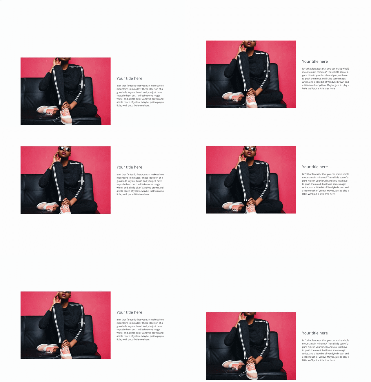
 Parallax scrolling enabled on text + image block
5. Earth tones are in
In the last year, Earth tones have become more present in website color schemes. People are moving away from stark whites and adding muted tones to create a feeling of warmth. This can make your website experience more inviting to users. It’s also less harsh on the eyes than bright white. Earth tones also feel natural and less techy. Whether they work for your website depends on your brand.
6. Using color as a graphical element
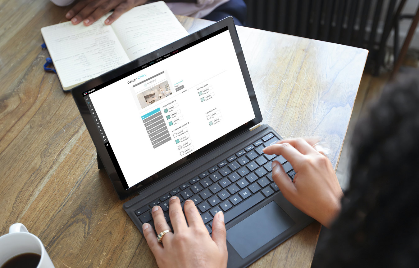
Enhancing the look and feel of your website can also mean using design skills. With a little Photoshop (or Canva) know-how, you can create some design elements to make sections of your website pop. A bit of color, text on an image, or even using some of our overlay effects can elevate a website’s presentation. Color can become part of your story and create cohesiveness for your brand.
Learn more about color theory.
7. Video boosts engagement
Video is king when it comes to attracting attention and engagement on social media. The same can be said about your website. Video remains a key tool that you can use on your website.
When it comes to video banners that loop, we recommend simple-to-no-graphics and no audio. Use live text on the banner and/or button to create a call to action.
For standard video elements, the sky’s the limit. If you’re using video for education , longer content seems to work best. For entertainment, shorter videos are better. For mobile, test, test, test. Embedded videos don’t always play nicely on mobile.
8. Full-screen hero images
Full screen design is taking over. Why shouldn’t it? Screens are continuing to get larger and display at a higher resolution. So, take advantage of full-screen banners and images when possible. This can include your hero banner on your homepage, which is often the first thing people see. It should stand out, be big, and draw people's attention right away. So go full screen and make a huge splash with your intro.
Want to try a template with a hero banner image? View Francis.
9. Smart loading or lazy loading content
Want to optimize the speed of your site? Smart loading or lazy loading is a feature you’ll want to enable. It can help you showcase a large gallery of images, without loading all the images right away. As someone scrolls down your website, they can click/tap to load more, or sometimes more images will load as they scroll. This is a particularly great feature for mobile. Not everyone wants to or needs to view 100 images before they become a customer, sometimes, all it takes is viewing 10 images. Search engines also appreciate lazy loading.
10. SSL security remains important
Lastly, security features such as SSL are important to make your site secure. It helps users and search engines know you’re a safe place to visit. Non-secure websites are getting penalized by search engines and becoming less visible each year, so make sure those security functionalities are enabled.
There is more to website security than SSL. You’ll also want to make sure you have security in place to help prevent bots from completing your forms with unwanted spam.
What are some design trends that you are seeing? Let us know in the comments! Also what other topics do you want us to discuss on the Zibster Growth Hub? We want to hear from you!


Leave a comment
0 Comments